CHALLENGE
In 2012, the magazine underwent a major transformation—this marked SaltComm’s first significant project. Our shared goal was to shape Képmás into a value-driven, high-quality, and financially sustainable magazine through conscious and consistent brand building.
SOLUTION
A key objective of the renewal was to engage younger audiences. Previously, the magazine’s core readership consisted mainly of older generations, so we completely rethought its visual appearance. The magazine was rebuilt from the ground up: a new logo, a refreshed visual identity, and a modern format were created. Even the smallest details were redesigned—from typography to paper choice.
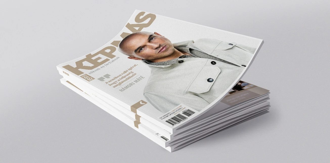
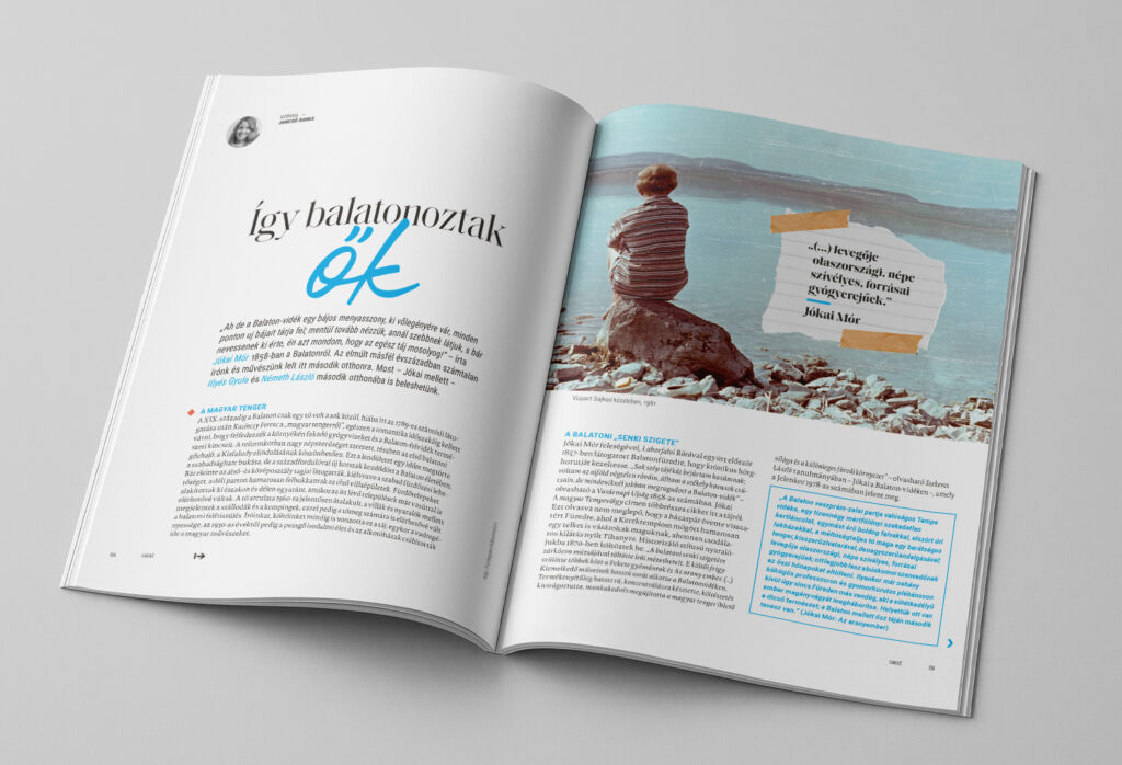
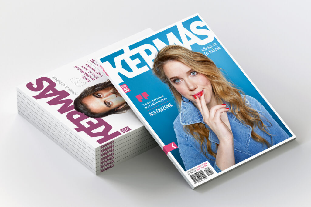
We wanted the magazine to stand out on newsstands through its clean, minimalist look. This is why we decided not to feature content teasers on the cover; instead, each issue presents a strong portrait accompanied by a thought-provoking quote. When designing the interior pages, special attention was paid to balancing visual consistency with visual dynamism. Articles are enriched with varied typographic, graphic, and illustrative tools, while adhering to a clear and well-structured editorial framework.
The renewal went beyond visual concept and layout: it also reshaped editorial principles and content structure. The magazine places strong emphasis on family, physical and mental wellbeing, cultural and natural environments, as well as practical questions of everyday life.
RESULT
Thanks to a clear and well-defined brand strategy and the work of a highly professional editorial team, Képmás has become a leading publication within the field of thematic magazines.